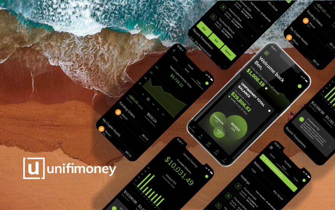
In this partnership, we became the design team for Unifimoney. Learn how we work with them and how the dashboard feature grew over time.
Great I think, I love to see fresh and better iterations of websites that I regularly use as well as lovely new shiny things! There’s a tattoo of a magpie on my arm to signify that shiny things collector part of my character.

I roll down the thread and start to see a fair few people complaining about some journeys not working (logging in, signing up to green bin collection, resetting password etc.). I think to myself, well, there’s always going to be teething problems when moving to a new CMS but in reality that’s what programmes of work, staging environments and QA team members are for so the live release shouldn’t have such significant issues. It should be seamless, and where there have to be creases, they should be ironed out through a campaign of comms through the channels that your residents (users) are on so expectations can be set well ahead of time. This wasn’t the case in this digital disaster!
I can feel the little, angry designer on my shoulder, starting to shout. I thought I had to try and explore why something this bad could have been something that someone pushed live and was happy with.
Now, I don’t know what the reason for the new website was. I guessed that it might have been a need to move to a new CMS (Drupal in this case as weirdly advertised at the bottom of the page). That aside, living in the royal borough in question myself, I know, like all local governments, it’s been suffering from budget cuts and this one in particular, has been suffering from some well documented, very opaque spending strategies under a previous council leader. Hence, there’s almost definitely been a budgetary issue hitting this new website project.
I’m not in a position to know the timescales for the project as a mere resident, but this budgetary issue has had a direct and telling impact on the quality of the end product. Quality in terms of user experience, quality in terms of the user interface and subsequently, the overall customer experience.
There are probably additional issues around the level of knowledge the procurement team have in putting website design and build out to tender and probably a preferred supplier list containing sub-par suppliers. There are probably problems with the level of experience of the team that maintains the website and with those that built it, but this post focuses on the resultant UI as it stands.
As far as government websites go, the bastion is gov.uk. It’s brilliantly functional, transparent and honest. The team that put the design system together are clearly, very knowledgeable across accessibility, typography and hierarchy. Jobs working with gov.uk are sought after like those in Facebook and Google in the UK – high praise indeed!
Subsequently, it’s a case study in how to design for accessibility and simplicity inside and outside of government. That’s not to say every website should follow its guidelines or example, but it’s a bloody good starting point for information-heavy digital spaces. You’d think then, that all other government sites should follow suit and use that as a baseline at the very least given all the hard work has been done.
To that end, I’ve tried to take the principles of gov.uk and adapt them for RBWM but let’s first take a look at the ‘new’ existing website (top half):

Great, you might think, there are clear navigation sections (not sure they’re links without interaction mind), clear COVID messaging (that’s maybe too large a space with too small text) and the brand colours are apparent (but perhaps too much so?). I see:
Now for the lower portion of the homepage:

Right, so there are some clearly delineated sections, but there are specific questions that need answering:
That then leaves the humble but ever-important footer:

It has some of, if not all the elements it needs, but there are still some design decisions that need questioning:
So, from a UI perspective, there’s a mountain of changes that need to be made just on the homepage to make this an acceptable release in my designer’s eyes. To that end, here’s a version that I put together in half a day to answer some of the questions I’ve bulleted above:

With the header, I’ve refined the spacing, made the icon usage and nomenclature consistent and given the search a consistent location and style that will work across all pages.
I’ve redesigned the COVID messaging to be a deliberately different style to the rest of the page to really show the emergency and temporary nature of the component. Initially, I had wondered if we could make this message dismissable, but I decided to take the gov.uk approach and have it accessible on every page. Still, I have refined it to take less space without losing its visual power.
I removed the local campaign messaging in favour of a generic local image of Windsor Castle. This could change to suit IP location within the borough, time of day, or be random but it’s a nice visual break between the header and the rest of the page. A new ‘how can we help’ message frames the content below. The local campaign content can be pushed the ‘updates’ content panel on the right of the next row.
The focus of this page is navigating to information the resident needs. To that end, as per the original design, I’ve kept the bulk of the page over to these links. I have added new description copy reminiscent of gov.uk to give the user more hints as to the type of information you’ll find in each section.
I’ve removed the set of icons in favour of a single link icon, so the label becomes the important part and not the large icon from the original design. Underlining links here makes it clear that links are links and other text is other text. Colour also plays a crucial part here where purple is the interactive/highlight colour for links and content.
I’ve added a new ‘local updates’ content panel in a pivotal position to keep residents up to date with time-sensitive information. Recently, it’s all been about the new Serco bin collection route changes, and that’s something people want to know about and here is precisely the right place to put that update.
A horizontal rule breaks the main, important part of the page from the lower, less important content.
I’ve restructured the content here to give a better notion of hierarchy to highlighted content as well as ‘latest news’ and ‘your council’. I’ve reduced the dead space in ‘latest news’ and ‘your council’ and removed the tweets.
In the footer, I’ve rationalised that down to text links using consistent typestyles and icons to help simplify the component. I could have kept the social media icons, but I didn’t want to give them visual priority over the legal links.
So, look, everyone knows you can’t redesign something without intricate knowledge of the problems the project aimed to tackle, the people and politics involved and the reason for and goals of the project. My aim here is purely to tackle woeful UI design on just one page of a huge website (of limited templates admittedly).
What I will say is that the outcome of the project feels like it doesn’t meet the needs of the residents and there’s nothing else this website needs to do that make the lives of the residents, including me, more manageable. Reporting a green bin not having been collected should be easy, logging in should be seamless and personal, information must be prominent and easy to access, the UI should be consistent throughout to make it easier to understand etc.
At NMD+, we invest in the time to research what residents/users want, to find out where and how they’re interacting to create engaging experiences that work for our clients and their customers. We invest our decades of experience in creating enterprise-level digital products with stable UI and UX. We partner with clients to consult on what not only what needs to be done but how creativity can show what can be done!