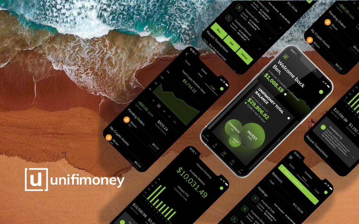
In this partnership, we became the design team for Unifimoney. Learn how we work with them and how the dashboard feature grew over time.
The Evolution of the Dashboard (part 3/4)
Part 3
In this four-part article, I have been walking you through what I’ve been doing for the past few months.
In part one, we looked at where we were and why. In part two, I focussed on the reasons we wanted to evolve our dashboard and what the result of that was. Now, in part three, we’ll see where we are now with the dashboard and what the plans are next for it.

It’s a classic, past, present, and future story!
Introduction
Just in case you missed the first part of the article series (catch up here) or the second (catch up here ), here’s what you missed.
Over the past 18 months, NMD+ has had the opportunity to invest in several interesting startups. These strategic partnerships have meant that we’ve been able to add a great deal of value to these select startups at various points in their journey.
One of the most exciting and advanced of those startups we’ve had the pleasure of working with has been Unifimoney.
As the name suggests, Unifimoney is a fintech startup solving the problem of having to have multiple apps on your phone to handle the different areas of your financial life. That alongside, guiding you in growing your net worth over time with key features in investing, saving, and spending.
The proposition was clear and compelling so at NMD+, we’ve been guiding Unifimoney from the initial MVP to something that’s market-ready and backed by our years of experience.
Version 2 – Keeping it Tactical
Once we’d taken the time to understand what was going on for users using the app we put a two-stage plan in place.
We needed to update that dashboard as soon as possible but we knew we couldn’t get everything we wanted to be done in one go. So, we planned a two-phased tactical and strategic plan. This would allow us to quickly get something out that would address some of the priority concerns around confusion before running a second stream of work to target all those issues and a few more we wanted to push such as updating the visual styles to be more appealing to the target audience.
This second version of the dashboard was all about simplicity and getting information to the user in a more visual way with less scrolling and less digging for information. We wanted users to feel more comfortable with each of the parts of the dashboard and ultimately, to understand and act on that information.

Confusion
The first thing we had to tackle was the confusion users were experiencing when wanting to get the snapshot of their finances from the dashboard.
[image of version 2 dashboard components x2]
What we did was to standardize each component as much as possible so that our users knew what they were looking at and allowed them to quickly scan the dashboard.
We wanted to reduce the number of things users were forced to scan. This meant we reduced the component templates down from…well, everything is bespoke to the feature, to just two.
The first template was designed to show the current status of a user’s cash flow. It was designed to answer questions like “what have I spent so far this month from my cash savings and on my credit card?”, “how much did I spend last month by comparison?”, and “is that better or worse than where I want to be?”.
The second template was designed to give a high-level view of where your self-directed investment portfolio was against the Robo portfolio. We used red and green as a super quick way of showing positive and negative movement within the last 30 days.
Finally, as a variation of the first template, the savings template looked to show the current make-up of a user’s savings/earnings. It was slightly trickier to rationalise this but we saw it as an iteration on the previous component and we knew we’d be looking harder at that component with the strategic version being worked on in parallel.
To tackle the time confusion issue, knowing that most incomes happen monthly, we set and made clear the fact that everything was compared to the month before.
The last thing we did was to allow the user to reorder the components on their dashboard to suit their needs. From the user testing interviews, one thing that keeps on coming up was the difference between those that valued certain components over others. We used that insight as a chance to experiment with moving the dashboard components around to suit the needs of the user.
User Testing Feedback

We managed to roll this dashboard out quite quickly so we were swiftly wanting to get this back in front of users to gauge if we were on the right path or not. We sent a new dashboard prototype back out to the initial user testing group to garner feedback and opinion.
After that feedback had been digested, we saw a lot of positive feedback coming from the beta user testers. We knew we were on the right track but there was still a lot to do.
We’d managed to get his version of the dashboard out quickly so there was room for a little more improvement. As the strategic dashboard was starting to come together it made sense to try and pull in some of the thoughts around components into this version.
Looking to simplify even further knowing the user could tap through and get more detail quickly and easily we reduced the information on the dashboard. We wanted to take that true car dashboard metaphor to the next level.

We felt there were only two or three things you need from this screen. Firstly, you need to know your cash situation, and secondly, the current situation with your investments. Was either in a good position or a bad position. If you need more detail then we can have that by drilling a little deeper into the app.
At this point, we also pulled another idea from the strategic dashboard version. We knew that existing users weren’t using all the features of the app. So, we wanted to create a way of highlighting those features that the user wasn’t yet using.
We created a new style of component that was deliberately different from the data focussed components. This allowed the user to mentally shift to an exploratory space rather than the data consumption space. It gave us the chance to upsell the features that would help the user grow their wealth quicker.
Summary
So, now you know where we were and where we are. We’ve made a whole bunch of changes for the better and there were more coming in the pipeline.
Look out for the next installment where I walk you through the strategic changes we had to make to get this app to a wider audience and what our plans are next!
Read next...


