In this partnership, we became the design team for Unifimoney. Learn how we work with them and how the dashboard feature grew over time.
Just in case you missed the first part of the article series (catch up here) or the second (catch up here ), here’s what you missed.
Over the past 18 months, NMD+ has had the opportunity to invest in several interesting startups. These strategic partnerships have meant that we’ve been able to add a great deal of value to these select startups at various points in their journey.
One of the most exciting and advanced of those startups we’ve had the pleasure of working with has been Unifimoney.
As the name suggests, Unifimoney is a fintech startup solving the problem of having to have multiple apps on your phone to handle the different areas of your financial life. That alongside, guiding you in growing your net worth over time with key features in investing, saving, and spending.
The proposition was clear and compelling so at NMD+, we’ve been guiding Unifimoney from the initial MVP to something that’s market-ready and backed by our years of experience.
In my previous installment, I walked through the tactical dashboard changes. We always knew there’d need to be a slightly longer-term vision of what we wanted to achieve with this important screen and the rest of the app from a UI and UX perspective.
We knew we wanted to move to a lighter version based on feedback from users. We knew the MVP UI would need to be dismantled and put back together in a way that felt more friendly given the target audience. We knew we wanted to simplify the language to make financial speak easier to digest and understand.
That’s why, alongside the tactical version we created and I talked about in the second part of this series, we had to keep a separate workstream going that would drive a strategic vision forward.
This is the story of that workstream.
Now we knew what we needed to achieve by this strategic version thanks to feedback and the initial user testing sessions, we quickly got to work. We’ve not long finished work on this and it’s being built as I type so we’re quite excited to get it in front of users and ask them the same questions we had at the start of this tranche of work.
This version had to answer all the themes raised from the user testing but we had so much more to add to this version. As I mentioned, the visual styles needed a huge amount of updating. We wanted to educate users on the features of the app they weren’t using and their benefits. And, we wanted to create an updated onboarding journey that got us to this new dashboard. That last one is another story altogether!
One of the components that we’d removed for the tactical version was that original lead financial growth piece.

After we removed it as part of the ‘confusion’ user testing theme there was a feeling with Unifimoney that we were losing a focus on the core proposition of guiding users to grow their wealth. We decided to bring that component back but make it clearer what the value of it was.

Another thing we’d noticed is that user profiles weren’t always complete so we wanted to use incentives and elements of gamification to entice users to go through and complete their profiles.
The benefit is that not only would you get a financial reward but your financial performance and growth would be better if you went through all the actions like ‘auto-fund your Robo investments’ and ‘transfer your salary’.
To do this we added a new row of elements that let the user know what the tasks were that were left to complete, how close they were to completing their profile (this would become part of the larger onboarding project as well) and what Unifimoney would offer them once a user had completed everything.
This also became a way we could identify and deal with fraudsters!
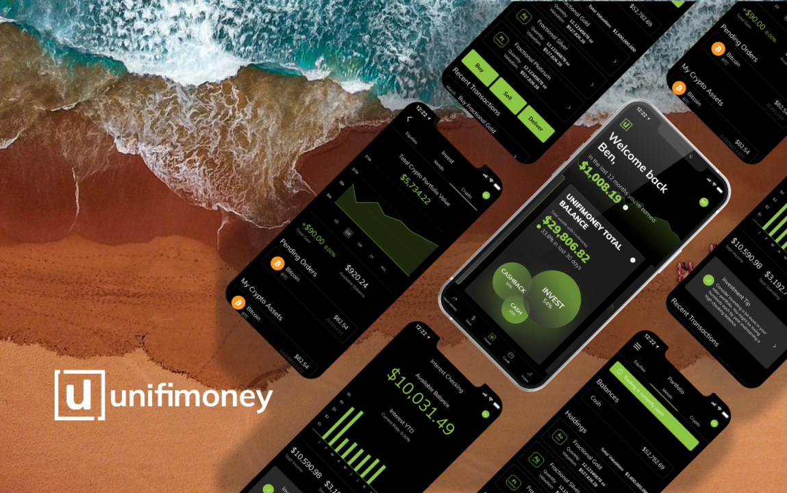
The lion’s share of this new strategic dashboard was rightly given over to the financial information. This time, rather than show everything, we wanted to focus the user’s attention on one thing at a time. One of the pieces of feedback we had from the launch of the tactical dashboard release was that there was still, maybe, too much information on the screen at the same time.

We dealt with this by creating more detailed but separate cards to house the information of each part of the Unifimoney feature set.

In the centre sits the ‘Unifimoney total balance’. This is a view of everything together so users can get a helicopter view of what their financial landscape looks like. How much of my wealth is invested, how much is sitting in cash and how much is in credit debt. We also wanted to show performance in comparison to the last 30 days, just like the tactical dashboard version.

Swiping left would reveal more detail on your investment portfolio separated into precious metals, cryptocurrencies, and stocks. We used the same bubble style of the graph as these new bubbles were a breakdown of the ‘invest’ bubble from the ‘total’ card. This also gave us the ability to add some visual power to the screen and move away from everything being written.
We pulled in the performance graph from the tactical version along with other details to make sure there was the feeling evolution between the tactical and the strategic dashboard designs.

Swiping further left would reveal the credit and cash cards. I wanted to talk about these together because they’re essentially the same design but hold slightly different information.
The reason these two cards use the same design is to foster a sense of them being part of the same thing. You can use credit cards to grow your wealth through rewards and cashback so spending on them and funding them via your cash account is a really good way of managing and maximising your day-to-day finances.
We wanted to encourage spending on the credit card by making them look similar to the cash detail card.

To the left, accessed by swiping right from the ‘Total Unifimoney Balance’ card, are the optional feature highlights, refer-a-friend, and full list of benefits cards.
These are designed differently from the financial information cards to let them stand alone given their difference in functionality and usage. We pulled in iconography and calls-to-action to foster engagement on certain cards and created a grid view of all the added extras Unifimoney customers can access through the app and our third parties.
Each one of those cards can be dismissed if they’re not of use.

Off-screen, we added more routes to engage the user in how to streamline and grow their financial wealth. These will be personalised to the user based on their actions and usage within the app.

Finally, the new dashboard introduced a new navigation bar. This streamlined the existing one and gave it more room to breathe in the phone frame. The visually powerful ‘Unifi button’ would allow users to come back to this dashboard at any time in the app whilst giving them access to the more detailed information within the investments, credit, and cash sections of the app.
So, now you know where we were and where we are. Our past, your present.
We’re already working on the next iteration of the dashboard and rolling that through our Figma files now so I’d be keen to understand if you have had similar problems and how you worked through them.